Spotted: Dell XPS 10, Snapdragon running Windows RT

Spotted at the Microsoft booth here at Computex is the Snapdragon S4 powered Dell XPS 10. This hybrid tablet comes with a 10-inch screen and a removable keyboard dock (popularized by the Asus Transformer).

Dell initially announced this in Berlin during IFA last year but is yet to be released in the Philippines.

The XPS 10 is powered by a Snapdragon S4 1.5GHz dual-core processor, 2GB of RAM and up to 128GB eMMC.

Both the tablet and the dock has separate internal batteries which adds up to a total of 18 hours in a single full charge. The tablet runs Windows RT so only apps coming from the store are usable.

The post Spotted: Dell XPS 10, Snapdragon running Windows RT appeared first on YugaTech | Philippines, Tech News & Reviews.

Dell Latitude 10 Review

A lot of people are looking for something portable yet powerful – in that case, maybe a tablet running full-on Windows 8. With an Intel Atom CPU, a 10-inch display and more, maybe the Dell Latitude 10 is the one you are looking for.

Design and Construction

When you first pick up the tablet, you’ll find that it has some heft. It feels solid as there is a matte rubbery feel across the back and to the sides. The tablet feels like it is rugged, but it actually isn’t.

dell

On top you’ll find the SD card slot,  the microphone, the rotation lock, an LED light and the power button. On the right is the 3.5mm audio port, the USB port and the mini HDMI port, while on the left is the volume rocker. Down below are two charging ports – proprietary and micro USB. Also there is another LED light for charging.

On the back, you’ll find lots of labels, the swappable battery & the camera w/ flash. Speakers are also found on both the left and the right sides.

design

To add, the buttons are hard to press as they all need a harder push to respond, and sometimes these little things get in the way.

As for the design, we have to say that it’s not ugly by all means, but it isn’t beautiful either. It also doesn’t attract much dirt, though fingerprints may be caught at times.

Display

The 10.1-inch display can be quite bright, and viewing angles are great since it’s an IPS panel. With that being said, it’s great for outdoor usage. The resolution is at 1366 X 768, and it delivers fair text; only if you look closely, you’ll find the pixilation.

display

Navigation is easy and it’s fairly responsive to the touch. Overall, we had no problems with the screen as it does everything well.

OS, Apps and UI

Windows 8 Pro runs the show here, and there isn’t much a difference with the usual.  All Dell did was to add a Getting Started app to help new users get around the system.

Screenshot (1)

We like how everything is clean and smooth – no signs of bloatware whatsoever. While some other manufacturers add tons of stuff, Dell barely did anything, and for a reason – we like it.

Multimedia & Camera

On the back are the two speakers that work great. It could be weak in volume at times though, but we solved that with VLC’s settings of 200% volume. Why did we use VLC? Well, the media player had problems with several video codecs, so we did that. With codecs aside, we didn’t experience any problems with video playback.

picture000

The 8 megapixel shooter on the back captures grainy photos, in whatever lighting it may be in, with or without flash. It’s soft, and the colors are a little inaccurate; the 2MP front-facing camera behaves similarly. However, if you just need a camera and that’s that, we think this package will suffice.

Performance & Battery Life

An Intel Atom CPU is nothing compared to its Core siblings, but with that aside, the Latitude 10 works naturally without lag. With 2GB RAM, things are a breeze. You will get to see it sweat though when you bring in heavy legacy apps, but we guess you’re not buying this for hardcore processing anyway.

Capture

Before anything else, try to hold on to your seats because this is the killer part – the Dell Latitude 10 has amazing battery life! It ran for more than 8 hours on our video loop with 50% brightness & audio, and WiFi sync was also on at that time. Dell is offering an optional extended battery too to double that, and all-in-all, this is what made the Latitude 10 something worth remembering.

Conclusion

With all of that said, we want you to take a hard look on the Dell Latitude 10 if you’re looking for something portable and powerful. All the other elements that looked bad on our review are just minor things and is just a look on what are the cons. Great to say, there aren’t many. You won’t need a great camera on a tablet anyways, and the hard-to press buttons aren’t really much of a problem once you’re used to it.

back

The Windows 8 model retails for Php29,999 while the one with Windows 8 Pro is at Php32,999.

Dell Latitude 10 specs:
10.1-inch 1366 X 768 IPS display
1.8GHz Intel Atom Dual Core Z2760 CPU
Intel Graphics Media Accelerator (533MHz)
2GB RAM
64GB internal memory
SD card, USB 2.0 support
8MP rear-facing camera with LED flash
2MP front-facing camera
WiFi
Windows 8 Pro
2-cell 30Whr Li-ion battery, removable
649g (weight)
274mm x 176.6mm x 10.5mm (dimensions)

What we liked about it:

  • Amazing battery life
  • Solid feel & construction
  • Not much bloatware
  • Snappy & fast

What we didn’t like about it:

  • Bad cameras
  • Buttons are hard to press

The post Dell Latitude 10 Review appeared first on YugaTech | Philippines, Tech News & Reviews.

Early build of Windows Blue leaks, updates previewed

Windows 8 hasn’t completely replaced Windows 7 yet, and Microsoft is already prepping up a big update to the operating system –  the long rumored Windows Blue, which is said to bring a lot of improvements and unification throughout MS’ ecosystem. The OS update leaks in the internet to give us a preview of what to expect.

WBLUE

The leak goes by the name of Windows Blue Build 9364. It’s not meant to be the complete version or anything, but it surely does present improvement. The notable ones are:

  • Internet Explorer 11
  • Smaller tiles for the Start screen
  • Calculator & Movie Moments app
  • Side-by-side multitasking
  • Improved PC Settings, added Search
  • Better SkyDrive integration
  • Accent color selection

WBLUE 2

Folks over at WindowsMania.pl has a video on it. It demonstrates all these new features well, although it’s in Polish.

The rumors about Windows Blue unifying Phone, RT & 8 is not yet evident here. Maybe we’ll get to see that sooner or later with another leak.

{source} {images via 1, 2}

The post Early build of Windows Blue leaks, updates previewed appeared first on YugaTech | Philippines, Tech News & Reviews.

Windows Phone 9: What We Think It Should Be

We have been playing around with Windows Phone 8 for quite a while and we had different views on Microsoft’s mobile platform. It turns out that there is a ton of room for improvement. Check out what we think it should improve on after the break.

1. Unification of Windows 8, RT and Phone.

First off, there are rumors going around that Windows Blue might unify the platforms of Microsoft: Windows Phone, Windows RT and Windows 8. It is very likely for this to happen, and we are welcoming this idea as well.

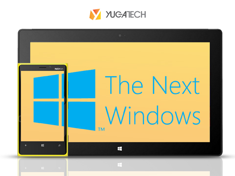
The Next Windows

After all, a single store for all the apps & less compatibility problems will work for their advantage. If Windows RT can run on the HTC HD2, then what stops this idea from coming true?

2. Changing of the Windows Name

However, I think it would be a good idea if Microsoft were to rebrand Windows.

Surface OS logo

The probability of this happening is very low, but what makes me say this is because Windows has lost its hype - especially among the new generation. Only a few would call it ‘in’ or cool’.

Also, Windows Phone isn’t as catchy as Android. Maybe for it to gain traction, they need a new naming scheme.

3. More Personalization

Come on. Almost everyone wants to feel unique and special. Maybe that is why Android has become very successful and why iOS is getting a lot of hate. People want their devices to stand out – which Nokia and HTC tried to capitalize on with all the colorful handsets, but it’s still not enough.

personalized screenshot

Windows Phone might attract several people such as the minimalists, but for it to be successful – there should be at least more personalization options.

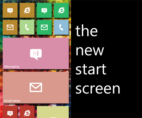
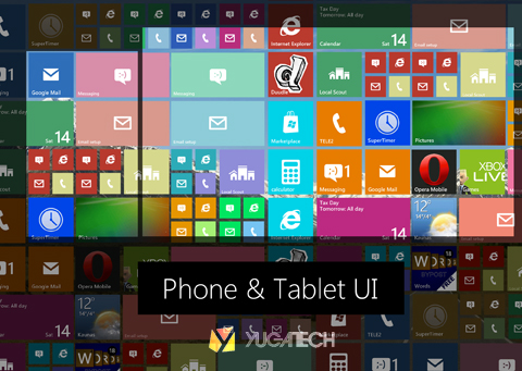
4. A More Flexible Start Screen

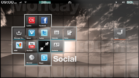
Remember Grid OS, Fusion Garage’s OS that had Android in its core but never was? Well, we talked about the flexibility of that OS’ homescreen and we found it most suitable for Microsoft’s Live Tiles.

Grid OS

Grid OS makes use of a very wide space where similar tiles can be found, and by pressing the home button, you’ll be redirected to the center. It seems like a more practical UI than simple vertical and horizontal sliding.

UIs

5. A Choice Between Grid and List App Drawers

Everyone uses grids for their app drawers, so why not Windows Phone? iOS is a grid of apps. Android has a grid for its app drawer (some skins even add the option to choose). Even Symbian had this.

6. An Improvement of The Little Things

While Windows Phone does a lot of things well, there are a lot of things that need improvement. For example, to reset the live account – you need to do a full reset of the phone.

bing

They could also improve on their services like Bing, SkyDrive, Live and etc., especially since they are forcing you to use them throughout the experience.

Perhaps we could also capitalize on the existence of the search button, which we barely used on our days with Windows Phone devices.

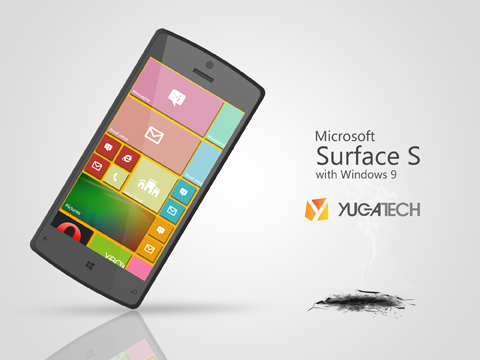
Surface S

Don’t get us the wrong way. Windows Phone is a wonderful OS; in fact, we all saw potential in it since day one, but it still has a long way to go. Is there anything that we missed? What about you? What would you add to Windows Phone to make it truly competitive with iOS and Android?

The post Windows Phone 9: What We Think It Should Be appeared first on YugaTech | Philippines, Tech News & Reviews.