There’s a new kid in the block that goes by the name of Photoplay and is looking to take on the king of the hill Instagram and be the next big thing in the app industry. Let’s see what this new photo-sharing app has to offer in our full review after the break.
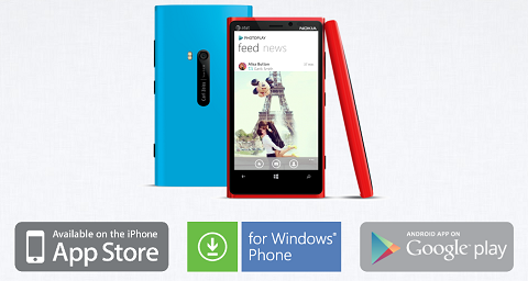
The App Store and Google Play Store (maybe even other app marketplace) is filled with apps which serve as an alternative to the popular photo-sharing app Instagram. Though many have attempted, none was note-worthy enough to capture the attention of the mobile shutterbugs. That is until Photoplay comes around.
Introduction
Photoplay is a free photo-sharing app that has recently made its debut on App Store, Google Play Store and Windows Marketplace (Windows Phone 7.x for the meantime). Now it may not be that big of deal for some, but the fact that the app made a simultaneous launch on three of the biggest mobile platform to date is a remarkable feat by itself.
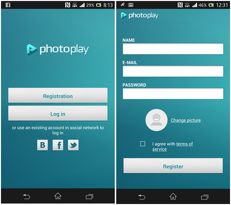
Signing up with Photoplay is rather easy. Users can create an account using their existing Twitter or Facebook account. If you have neither of the two (which I highly doubt), you can register using your email address and filling out the required field such as Name and Password.
Interface
After completing the registration, you’ll be greeted with a straightforward dashboard with 5 tabs at the bottom. These buttons’ function, even their respective placements, are identical to that on Instagram. This is a bit disappointing as the developers could’ve come up with something more creative. On the positive note though, it makes it easier for existing IG users to find their way on the new app.
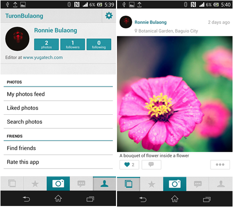
Although these buttons serve the same purpose as those on IG, there are some minor differences on the layout and features. The most significant dissimilarity can be found on the “Discover” (second from the left) and “Camera” (middle) tabs.
The Discover tab is divided in to two sections namely “Top Liked” and “On Map”. The former has three sub-categories that show users pictures with most likes from “Friends”, on a certain “City” and/or from all users under “Everything”.
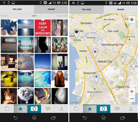
On Map, on the other hand, is similar to IG’s Photo Map feature which allows users to view geotagged picture on a map. However, instead of showing images per user, On Map shows all the pictures that were geotagged by a Photoplay user.
Now let’s go to the Camera tab. Instead of going straight to the phone’s camera app, users are asked if they want to “Take Photo” or “Choose from Library”. We’re really not a fan of this alteration as it may hinder users from capturing blink-of-an-eye moments because of this added press.
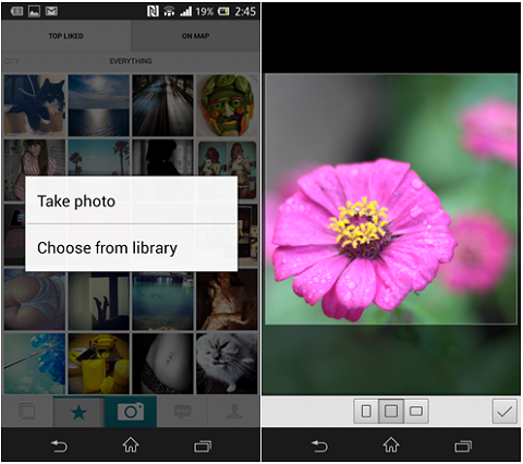
Fortunately, this slight drawback is evened out by the other features of the camera app. Once you’ve snapped or selected a photo from your gallery, you have an option to select from the three available frames; Vertical, Square and Horizontal. Just to set things clear, the frame that we’re talking about is not the fancy borders you can apply on you image, rather it’s the cropping of the image.
So instead of being limited to a resizable square frame, Photoplay allows images to be framed more appropriately and gives it users more control over their image.
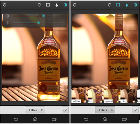
In addition to framing, the app also has some minor editing features to the further enhance the picture. At the top are four buttons namely Rotate, Vignette, Blur and Brightness/Saturation.
There’s a drop down button at the bottom for Filters which opens up 8 filters (no fancy names, just numbers) that you can apply to your image. Other than its simplicity, we also liked how each filter shows a preview of the image itself after it is applied, instead of generic hot air balloon photos on different hue.
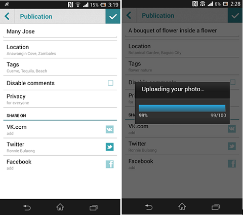
The next window is where users add some information about the picture such as description, location and tags. It also provides users with control over the comments and who can view the image being uploaded.
On the same window, users can also share their snaps on Twitter and Facebook by ticking on the respective icon. If left unticked, the image will only be posted on Photoplay.
What’s missing?
Being a fairly young app, there are some aspects of Photoplay that still needs to be improved on its next version. Here are some of the things we wished to be included on the future builds.
• Deeper integration on the device. Photoplay is not listed under the “Share” options inside the Android Gallery app which would’ve made it easier for users to upload pictures. Also, the app failed notified us when someone liked or commented on our post.
• Integration with other social networking sites. Currently, Facebook, Twitter and VR.com (a Russian SNS) are the only three SNS that users can share their uploads.
• Interface upgrades:
> Orientation. The can only be viewed on portrait as of the moment.
> The interface doesn’t have an option to share/reshare previously uploaded pictures to supported SNS. Matter of fact, the only selection available under “Option” is to delete the uploaded picture.
> Ability to download uploaded pictures.
> THERE’S NO SEARCH BUTTON?! The only search feature is “Search Photo” under Profile tab which is also useless at times.
• Stability. The app crashed a handful of times with no error codes and it automatically signed us out when it does.
Conclusion
I’ve been using Photoplay for the past few days, and I must say that it’s one of the more decent free alternatives to Instagram. Although most of the features of this app remained heavily influenced by Instagram, I really like the additional functionalities on the Camera and Discover tabs.

In our opinion, Photoplay still has a long way to go even be in the same league as Instagram, let alone take its position as the go-to-app for photo-sharing. However, it’s off to a great start and we think that with proper financial backing, Photoplay has the potential to be one of top alternatives to IG.
You can try out Photoplay by clicking on the respective links for your platform.
Photoplay for iOS
Photoplay for Windows Phone
Photoplay for Android
The post App in Focus: Photoplay for Android appeared first on YugaTech | Philippines, Tech News & Reviews.