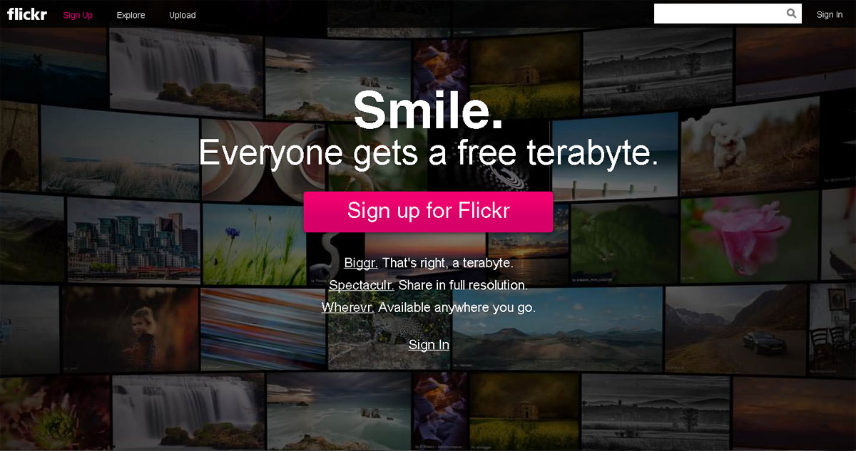
A free terabyte of storage. A thousand gigabytes. That’s how Flickr announced it was back in the photo hosting game.
Last week, Yahoo chief executive officer Marissa Mayer announced that the Internet pioneer is giving users of its photo sharing service Flickr a terabyte of free storage. That amount of free space boggles one’s mind.
To show it off, Flickr has a slider on its homepage that allows you to calculate how many photos you can store in your free allocation, depending on the resolution. If you store 8-megapixel pictures, the resolution of the iPhone 5, you could store up 436,906 photos.
‘Enough for a lifetime’
“That’s enough for a lifetime of photos — more than 500,000 original, full-resolution, pixel-perfect, brilliant photos. Flickr users will never have to worry about running out of space,” Mayer said in her post on Yahoo’s Tumblr, a platform that the company purchased at about the same time they announced the changes in Flickr, for over a billion dollars.
To put that free storage into context, the biggest free online storage I was able to sign up to is the 25 gigabytes I have with Box.net for signing up via an Android phone. A regular Box.net account offers only 5gb of free storage. Dropbox also offers 5gb of free storage with opportunities to increase it by inviting friends to use the service.
Reaction to the announcement is close to the response to when Gmail announced it was offering 1GB of storage to its free e-mail service on April 1, 2004. The announcement was made at a time when people had 2MB of storage for their free email accounts. But then years later, the other email providers also ramped up their storage. I think that would also happen in the photo storage service sector. Google, for example, already offers unlimited photo storage but only for standard size images of 2048 pixels at the longest edge. Here’s hoping they would remove that size limit.
Yahoo also announced a redesign of what had previously been an abandoned web property, adding the ability to share photos in full resolution and lifting the 200-photo limit imposed on the photostream of free members.
As soon as the announcement was made, I opened my Flickr account again after months of not visiting it. The most recent time that I reopened it was when Yahoo! released its Flickr app for the iPhone. I was given three months of Pro upgrade for free but was told that at the expiration, the 200-photo limit on the photostream would be imposed again.
Old Skool member
The Flickr of old is the poster child of what went wrong in Yahoo. The site was a trail-blazing service that had a strong following among its users. After it was bought by Yahoo, the service suffered.
I was part of the so-called “Old Skool” members, what the company called those who joined before it was purchased by Yahoo. I joined Flickr in August 2004 and used it not just for hosting personal photos but also those that I used in my blog.
Many bloggers also used Flickr for mobile posting because the service allowed you to automatically create a new photo post every time you email it an image for uploading.
But after years of stagnation, users left the service in favor of new sites and applications. For a time, I transferred to Zooomr, a similar service that was built by a teener out to prove that he could create a Flickr clone. That site, along with many of my photos, is now gone.
Sites like Instagram and Path then took over the photo sharing service while Flickr lay abandoned by Yahoo. Mayer referenced what happened to Flickr in her announcement of the purchase of Tumblr, “we promise not to screw it up.”
The Flickr of new is the poster child of a resurgent Yahoo.
When the company announced Mayer’s appointment last year, somebody spoke for the Flickr faithful by putting up a one-page site at dearmarissamayer.com asking her to make Flickr awesome again.
I think the site speaks for many of us when it now says: Dear Marissa Mayer, THANK YOU FOR MAKING flickr AWESOME AGAIN. ♥ the internet.
The post Why Flickr is awesome again appeared first on Leon Kilat : The Tech Experiments.


