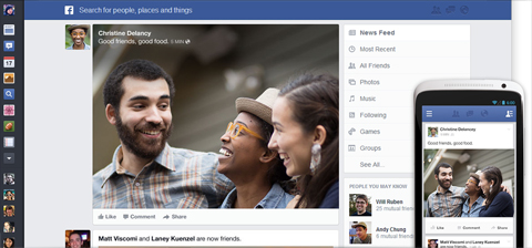
Facebook is continuing to maintain its position by introducing new stuff every now and then. We have another update to the news feed coming in a while, and it’s designed to unify the interfaces across platforms and make it uniform.
Goodbye clutter, hello bright & beautiful stories - that’s what Facebook is trying to do here. Basically, it’s meaning to simplify everything to work similarly with its iOS and Android counterparts. It features the same menu that slides out on the left side, with your usual stuff on top (notifications, friend requests and messages), while stories are now enclosed in rounded rectangles and are more media-centric.

Somehow, we can’t help but feel that Facebook took a page from Google Plus’ design language. Moreover, Facebook says that the update will allow you to further customize the news feed contents.
If you want to be one of those who’ll get it first, you can sign up here. We’re not expecting it anytime soon, since the same instance happened with Graph Search; some of us signed up and yet there’s no word nor trial.
We’ve read on some reactions to this, and some people were just like “a dislike button would have been better” or something more objective like “fix the Facebook Android app first (No internet connection)“. Does a redesign make sense? Of course, changes are inevitable, but is it supposed to be prioritized over other little things? Facebook has a position to defend, and we have yet to see how they shall protect their standing on the industry.
The post Facebook News Feed redesign coming up! appeared first on YugaTech | Philippines, Tech News & Reviews.