When the Cherry Mobile Hyper dropped by our HQ last week, it tagged along another 5-inch handset which goes by the name of Skyfire 2.0. While we’re still prepping our full review, we thought of sharing our initial thoughts about the handset.

The latest Skyfire is among the first batch of handsets that received a 2.0 moniker next to its name. As you might’ve already guessed, the name isn’t the only thing that changed here and we’ve taken the liberty of enumerating some of the improvements that the Skyfire 2.0 has over its predecessor.

Design and Construction
We can’t help but notice some similarities that this smartphone has with the Samsung Galaxy S2 and Google Nexus S in terms of design. It’s not an exact replica as suggested by the lack of curves on both the front and back of the handset, but the overall feel of the handset is undeniably inspired by the two aforementioned smartphones.
Occupying the majority of the area at the front is Skyfire 2.0’s 5-inch display which sits in between the three capacitive buttons below and the 2MP front-mounted camera at the top that’s flanked by the phone’s sensors and earpiece.

There are three buttons on each side of the phone; Power/Sleep/Wake button on the right and the volume rocker on the other. Up top is where the audio jack is located accompanied by the Micro-USB port for charging and wired connection.
Over to the back, you’ll find the Skyfire 2.0’s 8MP snapper along with its built-in flash and couple of brandings painted over a glossy back plate. A pair of SIM card slots and micro-SD card slot is found underneath the removable back cover which are situated just above the 2,000mAh battery.
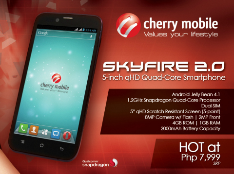
Cherry Mobile SkyFire 2.0 specs:
5.0-inch qHD Scratch resistant display, 220ppi
1.2GHz Snapdragon S4 MSM8625Q quad-core processor
Adreno 203
1GB RAM
4GB internal storage
up to 32GB via microSD
8MP camera with LED flash
2MP front-facing camera
WiFi b/g/n, 3G, Bluetooth, GPS
Dual-SIM
Android 4.1.2 Jellybean
2,000mAh battery
First impressions
The Cherry Mobile SkyFire 2.0 feels very solid in the hands and the buttons, both physical and capacitive, provides a decent feedback and are easily accessible . In our opinion, the overall feel would’ve been better if the OEM had chopped a few millimeters off of the top and bottom bezels of the handset. Still, we’re pleased to report that one-hand operation was still possible given these thicker-than-usual bezels.
If there’s another thing that we didn’t we didn’t like so much about its design, it’ll have to be the glossy back plate that attracts fingerprints and smudges like there’s no tomorrow. Other than that, we think that Cherry Mobile Skyfire 2.0 will be a strong contender in the 5-inch dual-SIM category.

After spending two days with the CM Skyfire 2.0, we have to say that we were so far impressed by its looks and how well it handled some of the basic tasks we’ve thrown its way. However, there are other aspects that we still need to look into before we can conclude that this handset is the real deal. Having said this, stay tuned for our full review in the next coming weeks.
The Cherry Mobile SkyFire 2.0 retails for Php7,999 and is already available through various retailers.
The post Hands-on: Cherry Mobile Skyfire 2.0 appeared first on YugaTech | Philippines, Tech News & Reviews.

