O+ Ultra 2.0 Quick Review

Announced just last month, the O+ Ultra 2.0 already landed in our hands and we’re ready to give you our thoughts on it. Join us in this quick review of this smartphone.

Design and Construction

o+ultra2-review-philippines-13

The Ultra 2.0 touts a 5.5-inch display that’s fitted with an HD display at 1280 x 720 resolution. This puts it at 267 ppi which is still pretty decent despite its spacious screen.

o+ultra2-review-philippines-5

Inspecting the upper part of its face, we see the 2-megapixel front camera accompanied by a single LED flash on the other side for lighting up those selfies.

o+ultra2-review-philippines-6

While at the bottom, we see the use of capacitive buttons for Multi-window, Home, and Back.

o+ultra2-review-philippines-4

Although the Ultra 2.0 just carries a plastic back cover, the company still made sure that it won’t look cheap. The backplate is designed in a way that it still looks presentable, even gunning for a metal appearance.

o+ultra2-review-philippines-11

Squeezed in the upper leftmost corner is its main 8-megapixel shooter that’s also supported by a single LED flash. Although not too obvious, the sensor is somewhat protruding and not seamlessly blended with its environment.

o+ultra2-review-philippines-12

The speaker grille comes in the form of a pinhole design below their signature branding.

o+ultra2-review-philippines-9

Here, we see the rounded corners of the device which makes it easy to hold. The overall design involves the main body, a single chrome accent surrounding the device, and the display that acts as the third and final layer comprising the handset.

o+ultra2-review-philippines-10

Up top, we have the 3.5mm audio jack as well as the microUSB port for charging the device and transferring files.

o+ultra2-review-philippines-8

The right side is where all the physical buttons are lined up. Here we have the power/lock button, volume rocker, and the dual-SIM slot that’s accessible using a poke pin.

o+ultra2-review-philippines-2

On the other side, the storage expansion compartment sits alone and also works the same way you access the SIM tray.

What we noticed regarding its form factor is that it’s a bit on the heavy side. The company didn’t disclose the weight of the handset but once you have it on your hands you’ll feel that there’s an extra heft to it and its 4000mAh battery pack is most likely the culprit.

OS, UI, and Apps

o+ultra2-review-philippines-ui

Running on Android 5.1, the Ultra 2.0 has the usual app tray and a few bloatwares. From its 16GB storage, users are left with about 12.40GB since the operating system took more than 3GB of space.

Navigating thru its UI was a smooth-sailing affair and we rarely noticed lags. Same was the case when jumping from app to app, and even when opening multiple tasks simultaneously.

Camera

o+ultra2-review-philippines-sampleshot-hero

Carrying an 8-megapixel rear shooter, we went around the Metro taking shots and testing how it would reproduce images. Check out the sample shots below:

o+ultra2-review-philippines-sampleshot-10 o+ultra2-review-philippines-sampleshot-9 o+ultra2-review-philippines-sampleshot-8 o+ultra2-review-philippines-sampleshot-7 o+ultra2-review-philippines-sampleshot-6 o+ultra2-review-philippines-sampleshot-5 o+ultra2-review-philippines-sampleshot-4 o+ultra2-review-philippines-sampleshot-3 o+ultra2-review-philippines-sampleshot-2

Performance and Benchmarks

o+ultra2-review-philippines-3

The Ultra 2.0 packs a rather modest set of specs including a 1.3GHz quad-core processor, 2GB of RAM, and 16GB worth of space for storing your media files.

Upon using it on a daily basis, we had no problems with the phone as a secondary unit for checking our social media sites. We also tried doing some light gaming on it and the handset handled them well. It is when we began switching between all those that the Ultra 2.0 showed some minor lags. It was pretty understandable, though, as we kind of exhausted the device doing so.

For those that are heavy on storing movies or games on their handsets, you’d be glad to know that the company is throwing in a 32GB microSD card free in every bundle of Ultra 2.0 — that’s 32GB more on top of the existing 16GB.

o+ultra2-review-philippines-benchmarks

We also ran our standard benchmarking tools and here are the results:

  • AnTuTu – 19,302
  • Quadrant Standard – 5,817
  • Vellamo – 1,126 (Multicore), 889 (Metal), 1,773 (Browser)
  • 3DMark Ice Storm Extreme – 1,898
  • PCMark – 2,857

Battery Life

o+ultra2-review-philippines-batterylife

As mentioned earlier, the phone is a bit heavy and this is most likely due to its beefy 4000mAh battery. It didn’t disappoint, though, as it lasted 9 hours and 48 minutes after running PCMark battery test.

The combination of its battery capacity, a decent quad-core CPU running on a fairly low clocking, and its non-Full HD display all contributed in achieving this longer-than-average battery life.

Conclusion

o+ultra2-review-philippines-1

The device is priced at Php6,895 and although it doesn’t have the best specifications available, it still handled tasks well and we actually haven’t encountered anything disappointing. If we were to nitpick, we’re not totally fans of its 8MP main camera due to the digital noise that’s easily seen, more so at night.

With the O+ Ultra 2.0, you get a battery performance that could last for more than 9 hours straight, a design that doesn’t look cheap, and a camera that shoots acceptable images.

O+ Ultra 2.0 specs:
5.5 HD IPS screen @ 1280×720, 267ppi
1.3GHz Quad Core Processor
2GB RAM
16GB internal storage
expandable via microSD
8MP AF rear camera with Flash
2MP Front Camera
Dual-SIM, Dual Standby
3G HSPA+
WiFi
Bluetooth
GPS
Android 5.1 Lollipop
4000mAh battery

What we liked about it:

  • Presentable design
  • Front flash for selfies
  • Longer than average battery life
  • All around decent performer

What we didn’t like:

  • Camera not for low light shooting

The post O+ Ultra 2.0 Quick Review appeared first on YugaTech | Philippines News & Tech Reviews.

O+ Ultra 2.0 Quick Review

Announced just last month, the O+ Ultra 2.0 already landed in our hands and we’re ready to give you our thoughts on it. Join us in this quick review of this smartphone.

Design and Construction

o+ultra2-review-philippines-13

The Ultra 2.0 touts a 5.5-inch display that’s fitted with an HD display at 1280 x 720 resolution. This puts it at 267 ppi which is still pretty decent despite its spacious screen.

o+ultra2-review-philippines-5

Inspecting the upper part of its face, we see the 2-megapixel front camera accompanied by a single LED flash on the other side for lighting up those selfies.

o+ultra2-review-philippines-6

While at the bottom, we see the use of capacitive buttons for Multi-window, Home, and Back.

o+ultra2-review-philippines-4

Although the Ultra 2.0 just carries a plastic back cover, the company still made sure that it won’t look cheap. The backplate is designed in a way that it still looks presentable, even gunning for a metal appearance.

o+ultra2-review-philippines-11

Squeezed in the upper leftmost corner is its main 8-megapixel shooter that’s also supported by a single LED flash. Although not too obvious, the sensor is somewhat protruding and not seamlessly blended with its environment.

o+ultra2-review-philippines-12

The speaker grille comes in the form of a pinhole design below their signature branding.

o+ultra2-review-philippines-9

Here, we see the rounded corners of the device which makes it easy to hold. The overall design involves the main body, a single chrome accent surrounding the device, and the display that acts as the third and final layer comprising the handset.

o+ultra2-review-philippines-10

Up top, we have the 3.5mm audio jack as well as the microUSB port for charging the device and transferring files.

o+ultra2-review-philippines-8

The right side is where all the physical buttons are lined up. Here we have the power/lock button, volume rocker, and the dual-SIM slot that’s accessible using a poke pin.

o+ultra2-review-philippines-2

On the other side, the storage expansion compartment sits alone and also works the same way you access the SIM tray.

What we noticed regarding its form factor is that it’s a bit on the heavy side. The company didn’t disclose the weight of the handset but once you have it on your hands you’ll feel that there’s an extra heft to it and its 4000mAh battery pack is most likely the culprit.

OS, UI, and Apps

o+ultra2-review-philippines-ui

Running on Android 5.1, the Ultra 2.0 has the usual app tray and a few bloatwares. From its 16GB storage, users are left with about 12.40GB since the operating system took more than 3GB of space.

Navigating thru its UI was a smooth-sailing affair and we rarely noticed lags. Same was the case when jumping from app to app, and even when opening multiple tasks simultaneously.

Camera

o+ultra2-review-philippines-sampleshot-hero

Carrying an 8-megapixel rear shooter, we went around the Metro taking shots and testing how it would reproduce images. Check out the sample shots below:

o+ultra2-review-philippines-sampleshot-10 o+ultra2-review-philippines-sampleshot-9 o+ultra2-review-philippines-sampleshot-8 o+ultra2-review-philippines-sampleshot-7 o+ultra2-review-philippines-sampleshot-6 o+ultra2-review-philippines-sampleshot-5 o+ultra2-review-philippines-sampleshot-4 o+ultra2-review-philippines-sampleshot-3 o+ultra2-review-philippines-sampleshot-2

Performance and Benchmarks

o+ultra2-review-philippines-3

The Ultra 2.0 packs a rather modest set of specs including a 1.3GHz quad-core processor, 2GB of RAM, and 16GB worth of space for storing your media files.

Upon using it on a daily basis, we had no problems with the phone as a secondary unit for checking our social media sites. We also tried doing some light gaming on it and the handset handled them well. It is when we began switching between all those that the Ultra 2.0 showed some minor lags. It was pretty understandable, though, as we kind of exhausted the device doing so.

For those that are heavy on storing movies or games on their handsets, you’d be glad to know that the company is throwing in a 32GB microSD card free in every bundle of Ultra 2.0 — that’s 32GB more on top of the existing 16GB.

o+ultra2-review-philippines-benchmarks

We also ran our standard benchmarking tools and here are the results:

  • AnTuTu – 19,302
  • Quadrant Standard – 5,817
  • Vellamo – 1,126 (Multicore), 889 (Metal), 1,773 (Browser)
  • 3DMark Ice Storm Extreme – 1,898
  • PCMark – 2,857

Battery Life

o+ultra2-review-philippines-batterylife

As mentioned earlier, the phone is a bit heavy and this is most likely due to its beefy 4000mAh battery. It didn’t disappoint, though, as it lasted 9 hours and 48 minutes after running PCMark battery test.

The combination of its battery capacity, a decent quad-core CPU running on a fairly low clocking, and its non-Full HD display all contributed in achieving this longer-than-average battery life.

Conclusion

o+ultra2-review-philippines-1

The device is priced at Php6,895 and although it doesn’t have the best specifications available, it still handled tasks well and we actually haven’t encountered anything disappointing. If we were to nitpick, we’re not totally fans of its 8MP main camera due to the digital noise that’s easily seen, more so at night.

With the O+ Ultra 2.0, you get a battery performance that could last for more than 9 hours straight, a design that doesn’t look cheap, and a camera that shoots acceptable images.

O+ Ultra 2.0 specs:
5.5 HD IPS screen @ 1280×720, 267ppi
1.3GHz Quad Core Processor
2GB RAM
16GB internal storage
expandable via microSD
8MP AF rear camera with Flash
2MP Front Camera
Dual-SIM, Dual Standby
3G HSPA+
WiFi
Bluetooth
GPS
Android 5.1 Lollipop
4000mAh battery

What we liked about it:

  • Presentable design
  • Front flash for selfies
  • Longer than average battery life
  • All around decent performer

What we didn’t like:

  • Camera not for low light shooting

The post O+ Ultra 2.0 Quick Review appeared first on YugaTech | Philippines News & Tech Reviews.

Android Benchmarks: Why it shouldn’t matter that much

A lot of people, tech-heads specifically, would look at the benchmark scores of a specific Android device before making any purchase decisions. We don’t normally do this when buying other devices with different mobile operating systems. Which brings us to the question — do Android benchmarks matter?

FIRST WORLD

Introduction to Benchmarks

First of all, let us explain what benchmarking is. Benchmarks are usually done to measure the performance of a certain device. It’s a numerical value we use to compare with other Android devices. In essence, it’s the measure of how fast a specific hardware can perform a set of tasks.

The Google Play Store is loaded with a lot of apps for such a purpose. Each benchmark too has a specific parameter to measure. The performance of your device is represented by these major components — the processor, RAM, graphics, internal storage.

While Android has a lot of benchmark tools in the Play Store compared to any other platform, some are also cross-platform.

Antutu is very consistent with its measurements of CPU speed, GPU rendering, storage write speeds and etc., while Vellamo does the same with slight differences, plus HTML5 benchmarking. Quadrant is also somewhat similar.

For the graphics, the gaming performance and all of that, there’s 3DMark, Epic Citadel and Nenamark 2. 3DMark just became available for Android, and it’s a heavy duty tool since you need to download nearly 300MB of data. It’ pretty comprehensive and is also available for iOS and Windows RT/8.

Nenamark 2, which we also use as a standard in our reviews, focuses on OpenGL|ES 2.0 benchmarking. Epic Citadel is also quite heavy, as it puts your device through Unreal Engine 3 with intensive graphics and measure frame rates.

Benchmarks can be inconsistent and unreliable. There’s also the fact that it can be manipulated. Here’s why:

People don’t usually go through all of that suite of benchmarks just to judge a specific device. A few tests or so will probably suffice but we can’t really let that be the main basis for the device’s performance, and we want to explain the logic behind this.

Here are the Antutu scores of devices running on a 1.5GHz dual-core Qualcomm MSM8260 Snapdragon, with the same GPU and RAM (1GB):

  • Sony Xperia S: 8418
  • Samsung GS2 Skyrocket (US variant): 6,336

Through that, you can see there’s discrepancy of around 2,000. Benchmarks can be quite inconsistent. The Xperia S features a higher resolution display so that’s a factor, though it doesn’t really make significant discrepancies. For reference, the HTC Sensation on a lower 1.2GHz and lower 768MB RAM scores in at 3,932 (that being qHD).

A bigger flaw is noticeable when you look at this next example. The Samsung Galaxy S2 has been very known for its Exynos processor, which raged through the benchmark charts in the past, and that pretty much started the Exynos craze. Due to network incompatibilities with US carriers, Samsung had to switch the Exynos with a Snapdragon (the SGS2 Skyrocket). A lot of people found this disappointing due to difference in benchmark scores of the variant.

Turns out, they were wrong. When the Skyrocket was tested, it got scores near to the dual-core Exynos for Quadrant, Antutu annd others. The interesting thing to note here is that HTC devices such as the Amaze 4G, which ran exactly similar specs to the Skyrocket safe for the qHD display, never went near the scores of the Skyrocket.

You can check out the specs of the devices here for confirmation.

COMPARISON

Here are the scores of the devices from the reviews of GSMArena (other sites’ benchmarks are approximately the same):

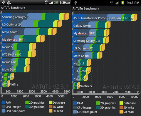
  • Amaze 4G on Quadrant: 2,793
  • Skyrocket on Quadrant: 3,224
  • Amaze 4G on Antutu: 3,641
  • Skyrocket on Antutu: 5,881

It’s very suspicious to see here that Samsung has a huge lead with the benchmarks when the configurations are almost the same. Samsung may have tinkered with a few elements to keep its title as the benchmark king. Plus, if that’s not enough, you should see another anomaly in our Starmobile Diamond review, where the Quadrant scores were suspiciously high.

Oh, and more on Quadrant; Android Central has an article and a video on how to play with the software to make your device give out higher scores than usual, without having to tinker with the CPU and all that.

Benchmark scores may also be affected by a lot of external factors — OS versions can greatly affect it (Jellybean has improved a lot of scores of older devices), background services and apps can also affect it, CPU throttling of some chipsets (like Atom Z-series) will also reflect erratic results.

Conclusion

There are still a number of people out there who would look at benchmark scores and immediately conclude that they should get that device after seeing superior numbers. We’d like to advise caution and give pause. From low-end phones to high-end ones, benchmark scores can be manipulated. After all, these are just apps, and hardware can be optimized to make sure they get good results on these benchmarks.

Even if you’re looking at the high-scorer out there (at the time of this writing) like the Samsung Galaxy S4, you can’t really tell the difference anymore as high-end Android phones have already eliminated the lag. Probably, the only thing worth looking at now is how well it works with software (as Windows Phone devices run smoothly in the UI even with low specs), and how great it is in handling graphics and power efficiency.

why

In the end, we still think people will still look at benchmarks. We advise that you don’t base your decisions solely from the numbers. Read reviews, watch hands-on videos, and ask people around you who have experienced the device. Real world experiences can never equal any glowing spec sheets and benchmark numbers.

{source}

The post Android Benchmarks: Why it shouldn’t matter that much appeared first on YugaTech | Philippines, Tech News & Reviews.