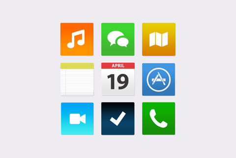
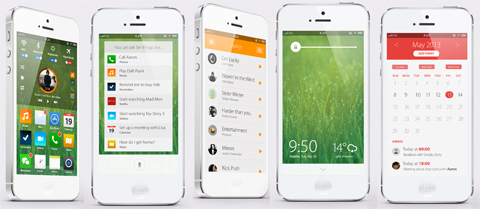
While Android may be facing just an incremental update in the next Google IO, Apple may be cooking up a major update to iOS. We posted a couple of reports for iOS 7 already, but we still have no idea how these details will be look like on the new OS.

The reports called for a flatter iOS, with improvements in multitasking and in bringing information. It’s a little hard to imagine all of that on Apple’s platform – but SimplyZesty seemed to have figured it out, and we like every bit of it.

They have managed to replace those popping iOS icons with a flatter look without having to look like a Windows’ Modern UI. They also introduced new app designs for the calendar and such. Camera, Siri & other apps looked more cleaner with the lighter elements that replaced the darker ones found in the present iOS.
Changes to the lockscreen are also made, and the designer also thought about a pull-down widget center. You can watch their video to fully appreciate it.
We’re hoping Apple’s software team takes note of this and does something better. Commenters everywhere were stating that the whole iOS 7 concept was like an offspring of Android & Windows Phone; would you agree with that? And is that a good thing?
WWDC 2013 will be coming next month, June 10-14, so stay tuned for more coverage.
{source}
The post This is how iOS 7 may look like appeared first on YugaTech | Philippines, Tech News & Reviews.