At first glance, it looks very similar to an iPhone – but run through it a little longer, you’ll find yourself exploring through a very powerful rendition of Android. What is it really, to hold something like the Meizu MX in your hands? Is it the perfect convergence of all the good things? Find out in our full review after the break.
There are actually two versions of the the first generation MX. One has a dual-core chip and the other has a quad-core chip, which is the one we have not. At first, we were actually confused if it was just dual-core just because of the unbelievably low retail price.
Design and Construction
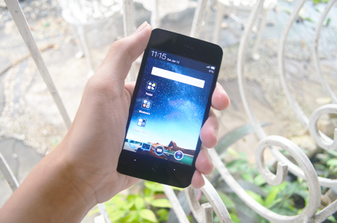
Almost everyone I know mistook the design of the Meizu MX as an iPhone at their first look. This is caused by the single home button, which has a weird feel to it, found below the display. On top of the 4-inch display you’ll find the earpiece and the front-facing VGA camera.
Few details that we’d like to emphasize was the capacitive buttons, which was composed of dots. Every time you change the orientation, the back & menu keys change orientation as well – which was a very nice yet simple addition.
On the left, you’ll find the volume rocker. On top you’ll find the 3.5 mm audio jack and the power button. Below is the micro-USB port and the microphone while on the right, there is nothing for you to see. On the back is the 8 megapixel camera, Meizu’s branding and the speakers.
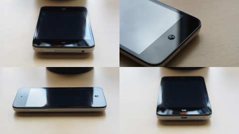
All-in-all, the device feels solid, even if it’s made out of plastic. In fact, up to a certain extent – we can even say it’s premium.
Display
The Meizu MX features a 4-inch qHD display which gives out a resolution of 640×960 (same resolution as the iPhone 4s). The display is sharp, vibrant and responsive. Viewing angles were beyond acceptable. We were very impressed with the screen.

4-inches could be perfect for some people, but if you’re a multimedia lover – it may lack in size. And surely, these days, people look at the screen and decide which category it should belong. For the most part, 4 inchers are relegated to the entry to mid-range levels.
OS, Apps and UI
The device runs Android, though not perfectly. It lacks Google apps out of the box and will need some downloads from the Play Store. It runs on what Meizu calls Flyme OS.
There is no app drawer. Like iOS, all you have is a homescreen of apps, a notification bar and that’s it. However, with this one, there is the availability of widgets, live wallpapers and more – the openness of Android. Bloatware is available too – which was very bugging. We just had them stuffed away in a folder to hide it.
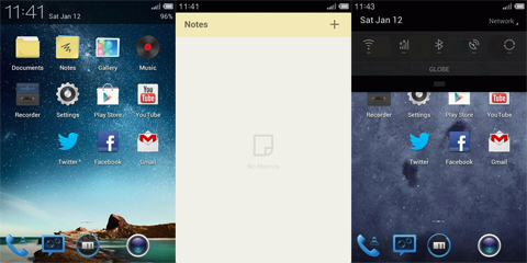
Meizu exerted a lot of effort in making their own apps (they replaced Google apps with their own version). We’re happy to say that they did a better job than most manufacturers with their own skins. It feels more polished and functional – although there are a few bugs with the keyboard and some elements.
Multimedia & Camera
The speakers delivered clear audio, but it was somewhat weak in volume. On the other hand, video playback was smooth and pleasant – but the screen size might be too small for some.
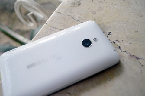
The 8 megapixel delivered sharp shots, but can be quite lacking in saturation. On the other hand, video recording lacked in sharpness and clarity in audio, and panning was a bit shaky. It handled light well however, and auto-focus was acceptable.

Performance & Battery Life
The Meizu MX is nothing but speedy. It rages through the benchmarks and delivers significant amounts of agility through the 1.4 GHz quad-core Exynos processor and 1 GB of RAM.

Benchmark results were very good. The quad-core chip performed well on our standard benchmarks — 12,949 on Antutu, 4,046 on Quadrant and 56.9 fps on NenaMark 2.

While the back cover is removable (and it’s a bit of a challenge the pry it open), the battery isn’t – so don’t attempt to yank it off (as it is strictly stated in fine print not to). For the most part, the 1,700mAh battery did a pretty decent job — especially on standby. When you run it through heavy tasks, that’s when it will deplete quite fast. It manages to get through a day and more, depending on the usage.
Conclusion
There is a lot to like about the Meizu MX. It symbolizes a nearly-perfect convergence of all the good stuff – but it needs more polishing and modernizing. The software is functional and fluid, but there are some bugs to come with it. Also, the device itself is a multimedia powerhouse – only held back by the small display.
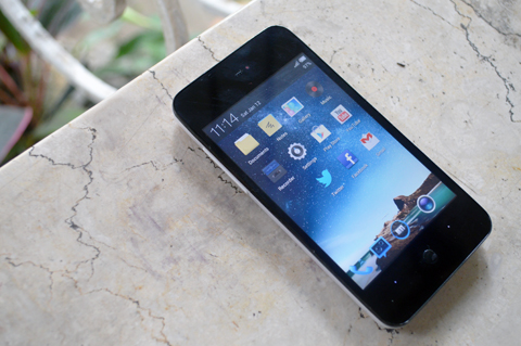
Meizu MX might look small because of the display but it could slug it out fairly well with other flagship handset. Other than that, it’s a great all-around device spare for a few software bugs and bloatware here and there. And, for a retail price of Php13,790, you can not go wrong with it.
Meizu MX 4-core specs:
4.0-inch display @ 960×640 pixels, 292ppi
Samsung Exynos MX5Q 1.4GHz quad-core
Mali-400 MP
1GB RAM
32GB internal storage
HSPA+ 21Mbps
WiFi 802.11 b/g/n
Bluetooth 2.1
GPS w/ aGPS support
8MP f/2.2 rear camera
1080p video recording
VGA front-facing camera
FM Radio Tuner
Android Ice Cream Sandwich 4.0
Li-Ion battery 1700mAh
139 grams (weight)
121.3 x 63.3 x 10.3mm (dimensions)
What we liked about it:
- fast & fluid performance
- sharp display
- solid construction
What we didn’t like about it:
- software bugs & bloatware
- 4-inches doesn’t compliment the phone’s capabilities
Disclosure: This handset is a sample review unit from Widget City. You can get this one for Php13,790 on their site {see listing here}.
The post Meizu MX 4-Core Review appeared first on YugaTech | Philippines, Tech News & Reviews.